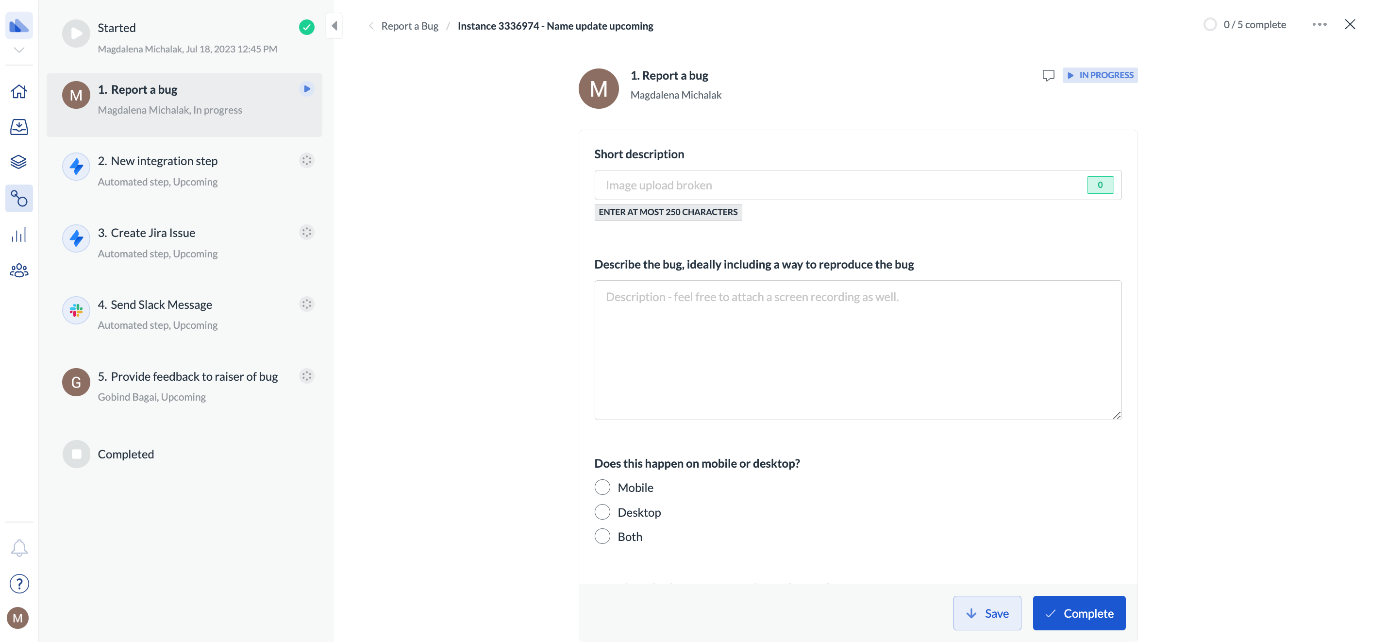
Explore types of form fields
Explore types of form fields
Table
Input fields
Routing
User selection
Files, images, barcodes
Drawing and signature
Dropdowns, radios and checklists
Form configuration
You can work with form field configuration when you click on a step and add a form field.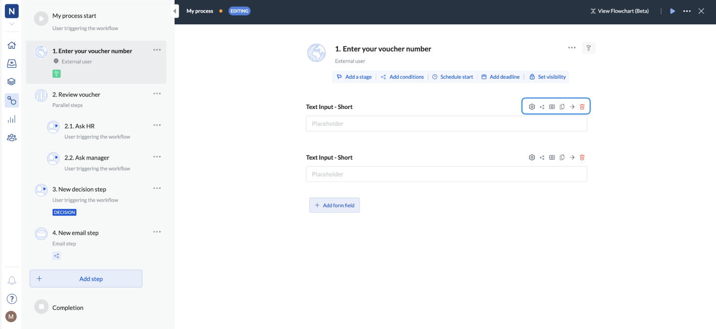
- Go to Workflows > Edit workflow.
- Click Add step.
- Select Form.
- Click Add form field.
- Click the settings icon to add placeholders for fields or labels (step titles), and make the step optional.
Setting form conditions works in the same way as step conditions. For details, see Set conditions to a step.
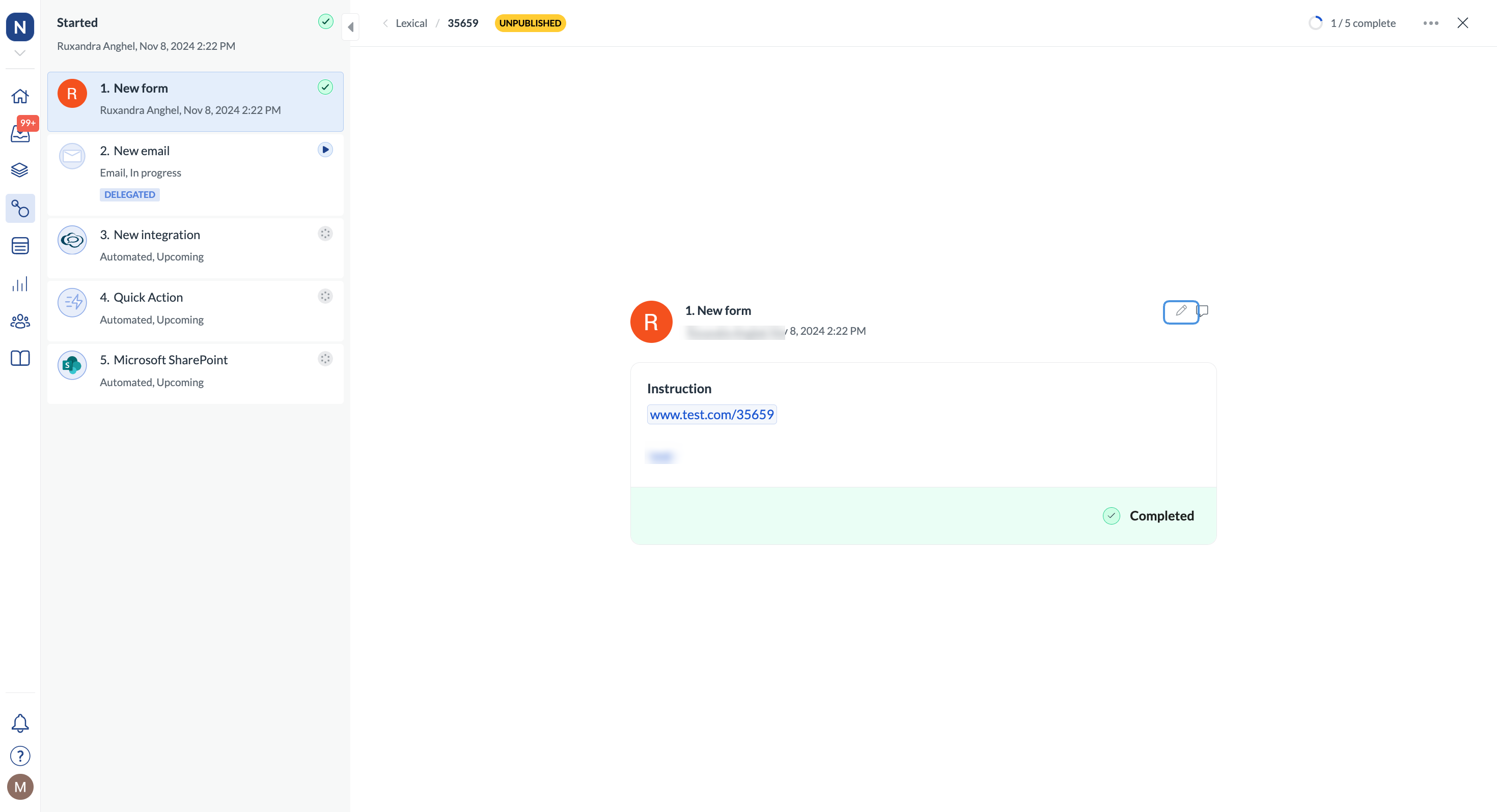
Edit a form field
After you’ve completed a form, you can still edit the fields if you’re an admin or a user assigned to the step or if the step has been delegated to you. If you go to the step (by following a link in the email), you can click the pencil icon, update your field data, and save your changes. Notes:- You can edit the step if the workflow hasn’t been completed.
- If there are conditions related to the step or any other dependencies that have already been completed, updating the field doesn’t change them.
- You can’t update the completed step using the API.