Input fields: text, date, email, address, instruction, URL, number
Input fields can be customized and prefilled for users to make form completion quick and effortless.
Not sure how to configure a form? Learn more…
This form field can be useful when asking users to provide a name or a short summary of a problem for a bug report. You can add validation, user tooltips, and prefill the field for the user.
This form field can be useful when you want users to provide a description. You can configure the field name and placeholder, and create a tooltip for users, which shows when they hover over the info icon next to the field name. The tooltip provides additional help and can define what type of input is expected.
This form field doesn’t require any user input but allows for adding workflow or step-related instructions. You can use this step to add data references and pull information from other steps to this step or send it on to external tools. You can also attach files or images to your instructions.
This form field allows users to select a date from a calendar. The date has this format: Tue, Nov 19, 2024. Tip: If you need the date to be in a different format, add an instruction field, select the date input as data reference, and use the cog wheel next to the reference to change the date format.
This form field asks users to provide an email address. You can decide on the maximum and minimum number of characters that users can provide. We are checking if the email format is correct.
This form field asks users to provide their address: city, street, and zip code. You can also define a tooltip for this field, which offers additional help for the users. The tooltip shows when users hover over the info icon next to the field name.
This form field asks users to provide a URL. You can prefill this field for the users.
This form field allows for numerical input. From a builder’s perspective, the field enables you to define what numbers or currency settings are expected and configure the type of thousands separator, the maximum number of decimal places allowed, and currency, and the position of the currency code (for currency).
Numbers or currency as data references
You can later reference the number as a plain number or with all the configured formatting. When you use data references that refer to the value from the number field, you have two options available:
- Plain reference: Always returns the raw number with a . as the decimal separator — it ignores formatting settings like thousands separator or custom decimal symbols.
- Formatted reference: Applies all the number formatting you’ve configured, for example, the thousands separator
If you haven’t applied any formatting to your number, both references will be the same. Note that prefilling only supports plain values without a thousands separator and ”.”(point) as a decimal indicator.
If you configure formatting for currency or numbers (for example, a thousands separator), it gets automatically added as users type. We also add any configured currency codes or symbols (like “USD” or ”$”).
Presenting decimal places
Numbers:
- Trailing zeroes are automatically removed/hidden. This means that if you enter 10.50, it will display as 10.5; if you enter 10.00, it will display as 10. The system removes unnecessary zeroes to keep numbers clean and simple.
Currency:
- Trailing zeroes are always shown according to currency standards. This means that if you enter €10, it will display as €10.00 (for EUR), or if you enter 5.5, it will display as 5.50. This follows financial conventions where currencies typically show 2 decimal places.
Large numbers
Next Matter’s dedicated number/currency field has a character limit of 15 characters. If you need to handle very large numbers, such as account numbers, IDs, or big financial amounts, use the short text field, as it doesn’t have character restrictions.
When you use the short text field for numbers:
- Set the text field to Allow numbers only to restrict input to digits.
- You might encounter issues sorting and filtering numbers in the text field in the instance table.
- No formatting for numbers or currency is available.
We recommend using the number field as the first choice, and only resort to the short text field as a fallback if your numbers are too long.
Add tooltip to field
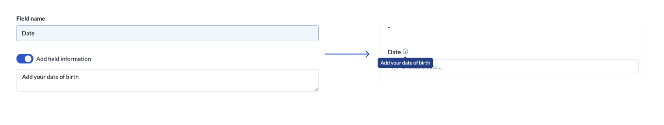
You can add extra information to help users provide the right input. The information will show when users hover over the info icon next to the field name.
Complete a form using API
You can update field data and complete a form using API. To see examples of the JSON body you need for each form field, see Completing steps.